|
Not too long ago I did an exercise that was designed to help "see your style." More so, it was designed to help the person doing the exercise see specifics that they are attracted to design-wise. The exercise started by having you rip pages out of magazines that you were drawn to (a good way to get rid of clutter, by the way ). You were not suppose to think about why you liked the page, just rip it out if you liked it and skip it if it didn't grab your attention. After ripping out a stack of pages you were to hang them up on a design wall (some of us just used the floor, ehem ) and weed out the ones that you weren't really excited about after all. In the pages that were left I started to see definite similarities and, it told me a few things as to why I am attracted to certain images and photography styles. This is what I learned:
Well, the b&w and candid images were not surprising to me, but the attraction to elements that only showed half was very prominent in the pages that I tore out and so were the bold fonts. As for the lines . . . It was very apparent in my pages that I LOVE lines and until now I hadn't really noticed just how much they play a part in my photography. There are both visible and invisible lines that lead our eye through a photograph. Photographers can use these lines (and manipulate these lines) in order for the viewer to see what he wants them to see, or feel what she wants them to feel. 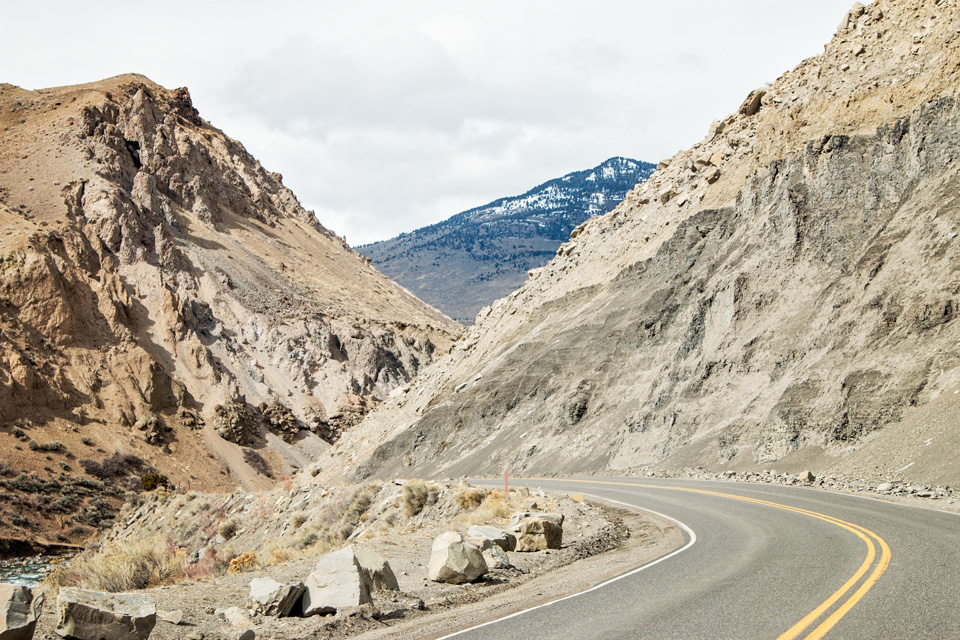 This first image was taken in Yellowstone and is a really good example of how lines play a big part in adding interest. The curving road leads our eye directly into the mountain scene. There are lines from the surface of each mountain leading from one to the other so that you eventually see all three. An interesting point here, is that the curve of the road also creates a calming effect that a straight road leading into the scene would not have. 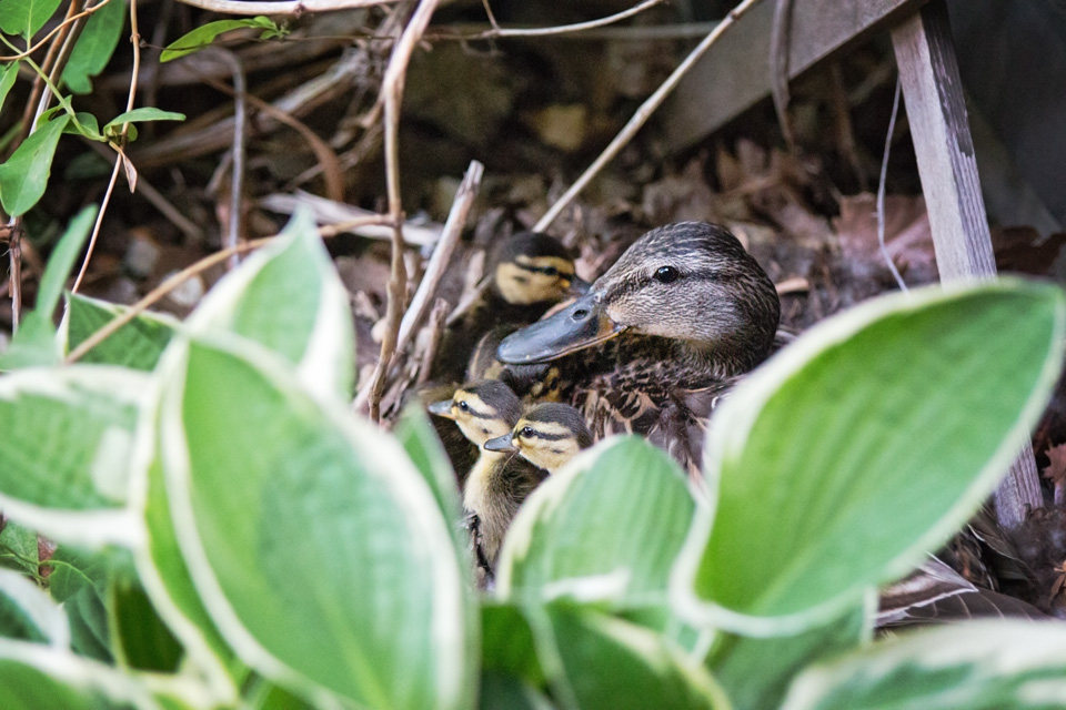 This second image is of our mama mallard who waddled off with her babies on Sunday. (She nested literally 6 ft from the front door! It was awesome watching the whole process ). You might be thinking, "There are no lines here besides the trellis." Oh, but there are. . . The most prominent element in the picture is mama duck, more specifically her eye. The line that goes through her eye is extended by her beak, which then leads to the ducklings. Going further, those babies are looking at something that we can not see and we wonder what it might be. Mama is also looking at something, but we don't really think about that because her beak leads us straight to the babies distracting us from that train of thought. Do you see what I mean? One more step . . . those babies are actually the only reason I noticed the duckling at the top . . . who just happens to be pointing straight at mom again. It's a beautiful little "cirrrrcle of liiiiife." ;O) 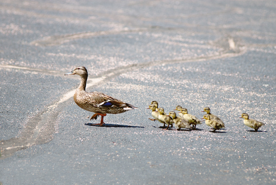 This last one is one of my favorites. Yes, they are all in a line and that "line" is going to walk right out of the picture. Where are they going? Are they walking towards something or away from something? The story is the first thing I thought about when I saw this image, but my favorite thing about it are the lines in the pavement. First of all, there is one straight line that goes from the left side of the image straight through to the other side and it's lined up parallel with those ducks. It's the least noticeable of the lines, but we now have it in our head that these ducks will walk straight off the page rather than angling towards the top or bottom. As for the pavement lines in general. . . the lines lead outside the image - just like the intention of the ducks. They are not straight lines, they are meandering - echoing the round about path that this family took. They are not harsh lines - they are soft like the feel that we associate with these ducks. And . . . the main line leads directly to mama duck making sure that you know she is there, too when our tendency is to only focus on the babies waddling after her. Did I plan this picture with these lines? No. But, by noticing details like this after the fact, we are more likely to see these sorts of things when taking pictures in the future and will be able to manipulate them in our images. I took about a dozen pictures that look just like this one except that the pavement was different in each one as she crossed the parking lot. This image was the only one without bold straight lines (or no lines at all) and it was by far my favorite. Ok, I got a little long winded there so, enough about lines . . . here are some more pictures of mama duck taking her babies out to see the world. :O) To see how other's in the blog circle use lines in their images, you can start with Kim at See Spot Run Photography in Charlotte NC.
A big thank you to our veterans and their families on this Memorial Day weekend.
1 Comment
For this round of Project 52, we are taking a little break from the book as our project leader has thrown in a "freestyle" challenge. This week the prompt is, "colorful." I was so excited when I heard this word. Then I quickly realized that we are still in the "cover-your-plants-tonight-because-it's-going-to-be-below-freezing" season . . . ugh. So, where can I find color when there are really no flower gardens yet? A friend suggested a nursery. Yep, they have lots of color . . . and I have a leg lifter. Maybe not. Hermes and I started with our front door. It was ok, but it wasn't much of a challenge (unless you count Dash and his mad photo bombing skills).  So, I spent a couple of days looking around town in search of color and I did find a few places. 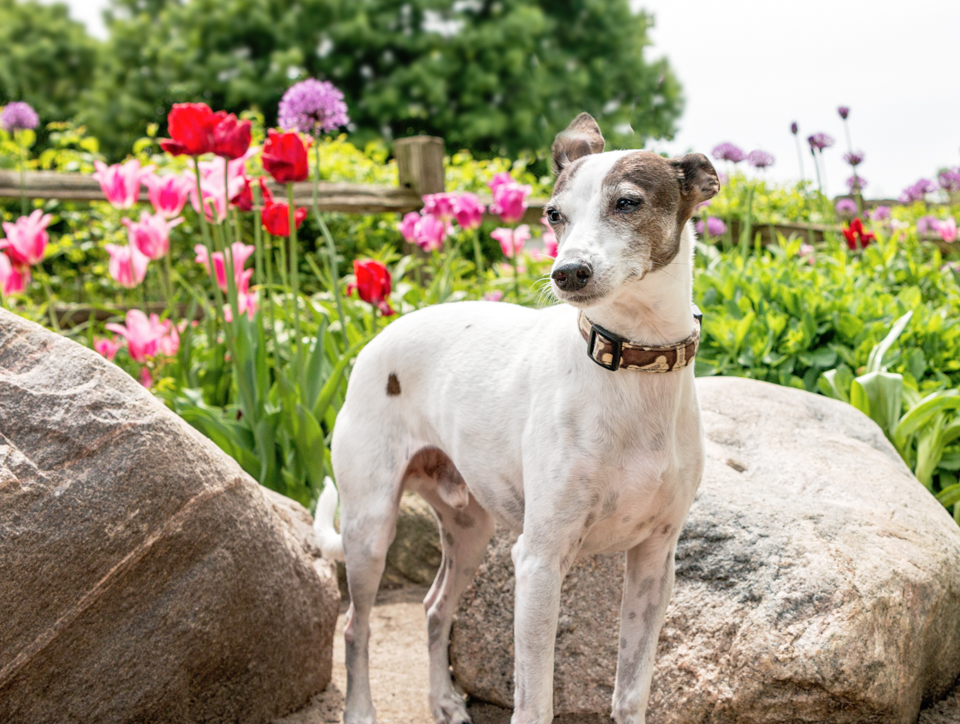 McKennan Park 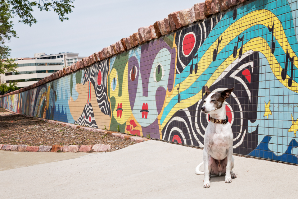 Downtown Mosaic Wall 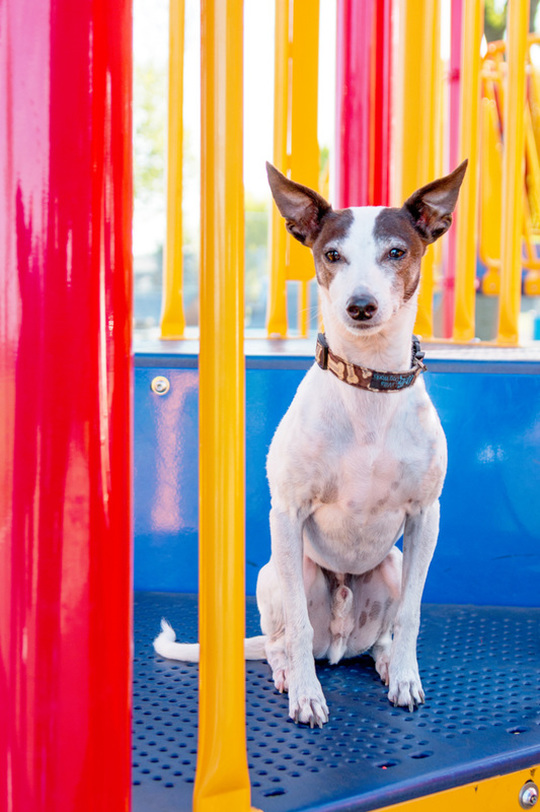 The Playground Then I realized that the night sky has color too (where we were shooting I had to enhance it a bit, but that's ok, too) ;O)  Feel free to check out the blog circle and see what others came up with for color. You can start with Becky at Future Framed Photography, South Dakota.
I hope you have a colorful weekend! For this week's Project 52, our challenge was to recognize and use patterns in our images. Patterns are lines or shapes that repeat themselves, thus drawing our attention to the shape of them. David Duchimen states,
To make an interesting pattern into an interesting photograph we need to add a "surprise" of sorts. If there is an unexpected element within our image, then the viewer might be more intrigued. When there is a break in a pattern it grabs our attention. It's quite challenging to think of ways to incorporate pets into the images that we take for this project each week, and this one was a tough one for me. I told some of the others in the group that I was trying to think outside the box, . . . but someone kept closing the lid on me! In the end, I came up with 3 images to illustrate the whole "making a pattern a little more interesting" thing. . . 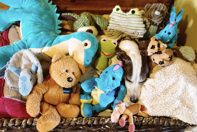 1. Hermes is a surprise or "break" in this otherwise messy image of stuffed animals. We don't expect to see him there so it's a little more interesting than just a picture of stuffed animals. 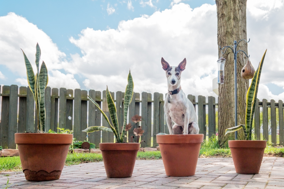 2. If you picture a long line of pots (much longer than this) with Hermes thrown in where you expect to see another plant . . . well, then you have a break in the pattern making it a little more interesting than just a line of pots. (My thought here was that these particular plants kind of mimicked Hermes' ears. I did mention that the lid on the box kept hitting me in the head, right? . . . please don't judge my work by this image. lol ) 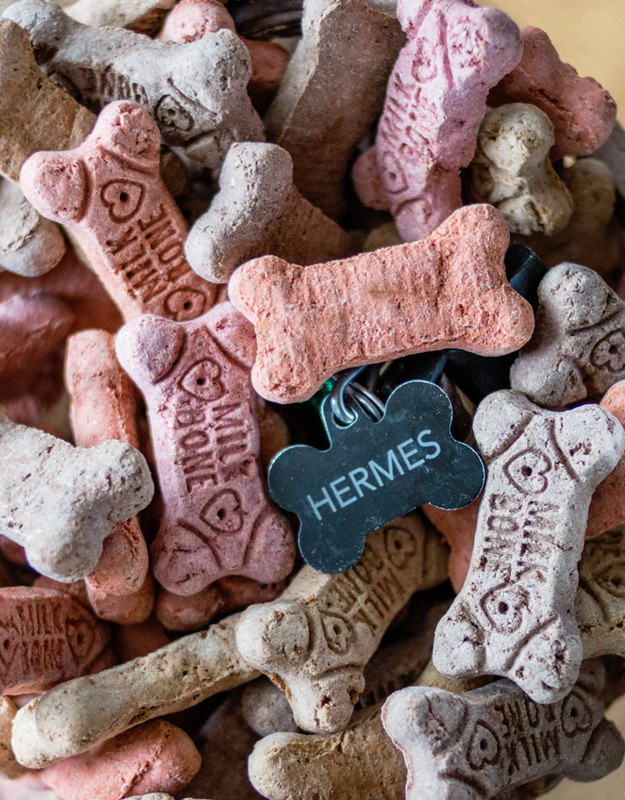 3. Another way to break up a pattern, thus giving more attention to the pattern itself is by throwing in a contrasting color. Because the tag stands out and echoes the treats, it makes us notice the pattern more, be it consciously or subconsciously. There are other's who were with me in trying to step outside that box this week. (I don't know about them, but I may bring a sharp pair of scissors with me to the next challenge.) ;O)
You can take a trip around this week's blog circle starting with Kim at See Spot Run Photography, Charlotte NC. Enjoy your weekend! These Project 52 posts consist of topics pulled from David Duchemin's book, The Visual Toolbox. Lines are a part of every good image. They can be physically visible lines or subtle lines built into the image, but every photo has them. These lines add interest to a photo, direct the eye, add depth, and they can also add energy. I took Hermes to the bike trail yesterday to get some images for this week's post. (Ok, and to get out of the house on a GREAT day weather-wise after dealing with a flooded basement for the past 2 weeks . . . It was a win-win to take him to the trails . . . and another win when I got a DQ s'mores blizzard afterwards.) ;O) First, we'll look at images that have physical lines in them. You have complete control over the lines in your images and can change what those lines do by simply changing the angle in which you shoot. The first two images are a simple example showing a dramatic difference. The first is shot head-on and the second is shot from the ground looking upwards. These images also have nice depth to them. This is because the lines travel into the photo making you feel like you are looking into the scene rather than at a specific element. 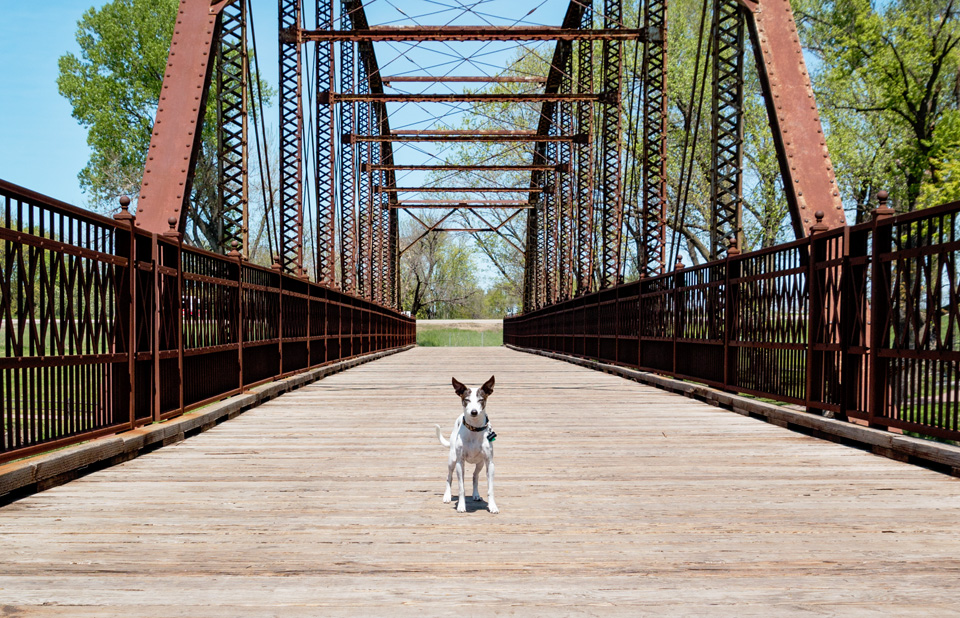 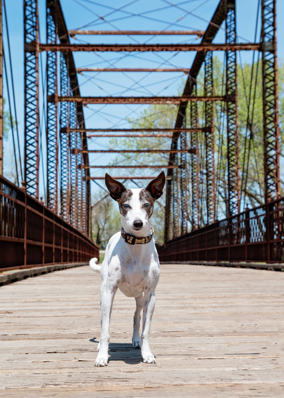 In this next image the railing is seen as one diagonal line because of the way it tapers off on the right. Had I taken this picture of Hermes as a portrait (vertical) rather than a landscape image, the railing would have shown as vertical lines behind him and had a totally different feel. (Hermes isn't really giving me attitude; the sun was just super bright at 2 in the afternoon.) 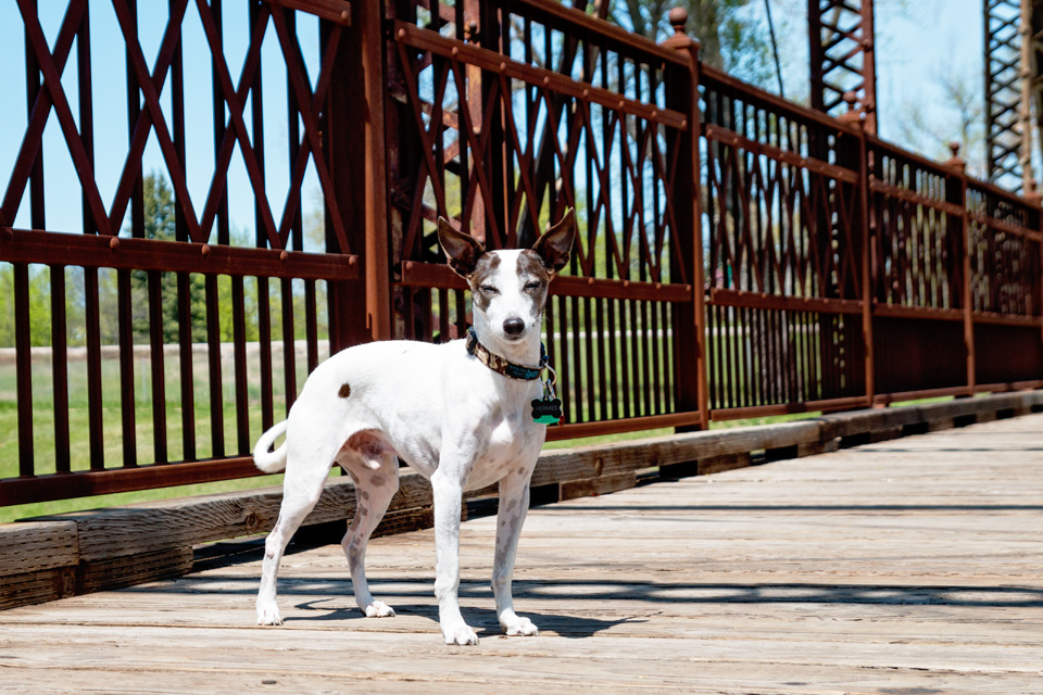 Looking at the image below, there is interest and depth, but I'm also able to lead the viewer's eye. The first thing you see is Hermes, but then the railing leads to the man on the bicycle. The man on the bike is an element that gives the viewer a little piece of the story that this image might tell. 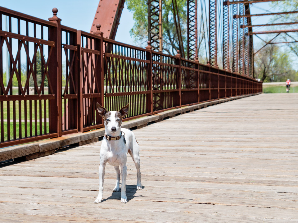 These next two journalistic style photos show how diagonal lines give energy to an image. In the first one, we see 3 dogs. We are able to see all 3 dogs at once and we say, "Awww, what cuties!" (You said that, right? ) 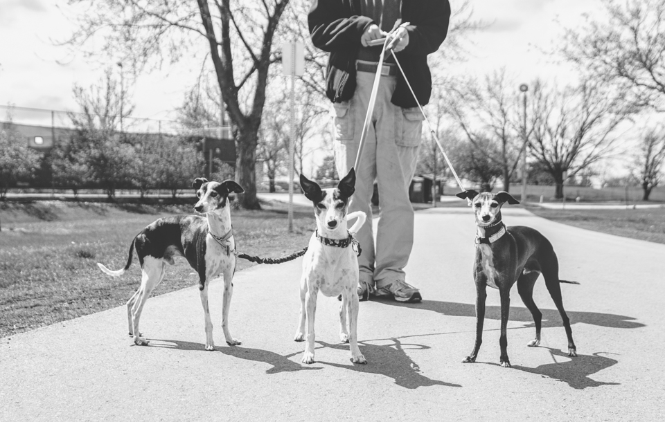 In this second image we see Hermes, but then we see Walter, and then Dash (who is about to drop to the ground because he hates the wind and hits the dirt whenever there is a big gust - I think he might be living in the wrong state ). In any case, our eye goes from one dog to the other and then back again, sometimes multiple times. This is due to the fact that the dogs make a diagonal line. The diagonal line creates energy in the image and thus we want to stay and look a little longer. Without going into all the science of how we see things, it's also worth noting that the fact that we view this image from right to left, instead of left to right, also creates interest. 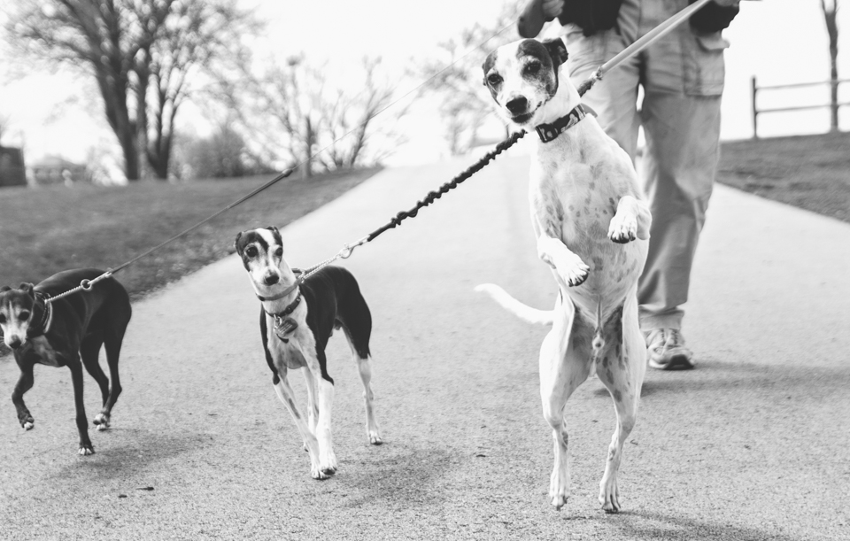 I hope these Project 52 posts help you to see things you haven't seen before when you are taking pictures, be it with a camera or your cell phone. To continue around our Project 52 circle of pet photographers, please start with Becky at Future Framed Photography, South Dakota.
I hope you have a wonderful weekend . . . and just so you know, the DQ s'more blizzards are quite yummy. ;O) Color in photographs not only grabs our attention, but can also set a mood. When there is bright, bold color in an image we notice it right away and that's what usually stands out in our mind above all else. It can be a great tool for a photographer to bring attention to his subject. On the flip side, it can also prevent us from seeing the subject or even the story that the photographer might have wanted us to see. Bold color can prevent us from seeing other elements in the image as well. There are times when color can also give the wrong impression. The author of the book we are following for this project points out that if you are documenting a tragic event and there is bright, cheery color in the image, the viewer might be pulled in the wrong direction emotionally creating imbalance as to how they should feel. Below are some examples to help show you a little of what I'm thinking when I decide whether or not to create a black and white image over a color one. This image was taken in Germany where dogs are allowed literally everywhere. (It made me smile seeing so many.) :O) Move the slider so that you see the full color image. Now, name the first 3 things that you notice when you glance at this photo. When I look at this image the first thing I notice is the bold red color; the table. If I think out loud about what I'm seeing, the second thing I notice is the men inside the shop because the red color leads me right to them. It's only after seeing these things that I finally see the dog. Now, move the slider so that you see the b&w image. When I look at this image I see two things equally. . . the dog and the coca-cola logo. This makes sense because the black dog stands out on the light background and the white logo stands out on the dark table. These two elements have equal weight and are even on the same level with each other. The men in the shop are almost un-noticeable as my eye is not led to them by anything else. In color, this image to me, is one of a dog taking a nap. Simple as that; he looks content. When I look at it in b&w I see a "street dog" without a home of his own and he looks kind of sad and lonely to me. It's the grungy textures that are more noticeable in b&w that change the mood of the image. This adorable little guy wows everyone with his blue eyes. His eyes are the first thing I notice when I see the color image. When I change to b&W I see a white puppy and I now notice the stars below his paw where I didn't notice them before. I also see that he has a patch over one eye that I didn't notice before. (Did anyone else move the slider back and forth specifically to see what color that patch was? ) In color, I see his eyes and pretty much of stop looking after that. I would remember this image as a puppy with beautiful bright blue eyes. But, in b&w my eye is led from his face, to his big puppy paws and then the stars. With the absence of color I see more elements in the photo that I might otherwise miss. There are any number of reasons to create images in color and just as many reasons to create in b&w. I love color. I wear bright colors and I have bright colored walls in my home. But, when it comes to photographs I have this thing for black & whites. So, color or b&w . . . it's a matter of choice, and both are right . . . The best part is, because you are the artist/photographer, you get to choose. ;O)
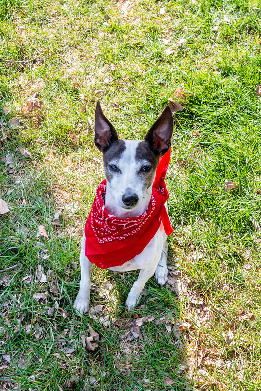
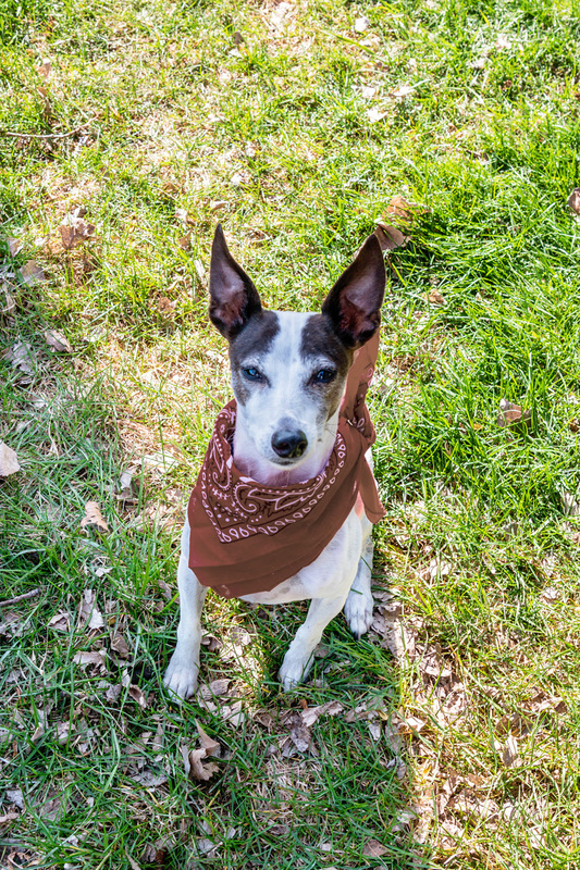
If you'd like to see other Project 52 photographers thoughts about black and white photography start with Future Framed Photography, South Dakota. Each blog post will direct you to the next in the project circle. I hope you have a wonderful weekend! This week's Project 52 is about color in images, specifically contrasting colors. When thinking about the color wheel, the colors that are directly across from each other are considered complementary. These pairs best illustrate the use of contrasting colors in photography. 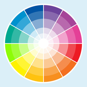 Here is the gist of how you can have a little control over color and it's effect on the outcome of your image: Colors in the color wheel are either visually active or visually passive. The active colors are the yellow, orange, red and magenta range while the passive colors are the green, teals, blues and purples. Active colors tend to visually advance when placed on a passive color and passive colors appear to visually recede when placed on an active color. In other words, brighter/warmer colors appear to leap forward and cooler/darker colors fall back. Now, some people can see it easier than others, but here is an example that I hope will demonstrate this whole advancing and receding thing. Red is complementary to green so Hermes' red bandana appears to advance in the first image, whereas the brown bandana appears to fall back into the picture in the second. Can you see it?
Knowing how color is seen is just another way to help get an image to tell a story the way you want it to be told. You can play with color (with planning beforehand or afterwards in editing) to make an object stand out more, or make it blend in so that it's not as noticeable. In this next series of pictures, you can get a feel for what different colors will do when green is the background. 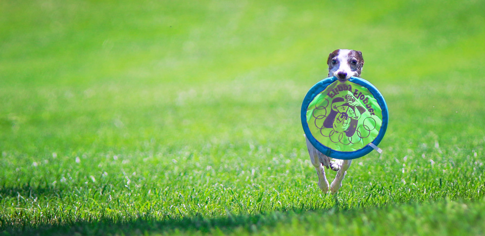 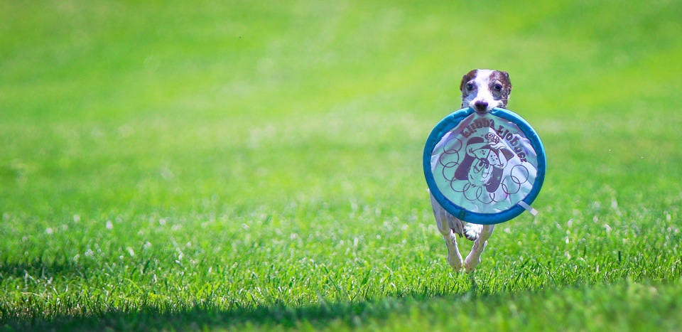   This last picture is a great example of something else that results when using complementary colors . . . When you put something large in an image with something small, the large object, by contrast looks even larger. The same thing happens when using complementary colors - The grass in the image is green, but when you include something magenta, the grass looks even greener. Next up in this project circle is Pat Corl, Field and Ranch Photography, Greenville TX.
I hope you have a wonderful weekend. Do something fun! When a photographer wants a new challenge, they create one; something that will spark creativity. One way to do this is to create a project. The idea is to decide on a subject, a topic, or something that will give a group of images a cohesive feel, then take pictures that represent that challenge. Color is one way in which photographers can create cohesiveness in their images and photography style. There is a fabulous commercial photographer who has an instantly recognizable style. Her name is Kaylee Greer and she owns Dog Breath Photography out of Boston. Her photos are up close and personal, and she uses bright, bold, colorful skies and backgrounds giving her art a very cohesive look no matter where the images were taken. Scroll through her client gallery of thumbnails and you'll see what I mean. She's amazing! For this week's challenge of creating a color palette, I used Dash as my subject. This picture was taken in our back yard. We have lots of brown grass with a little bit of green, and lots of leaves. (Nothing says "lazy yard worker" like leaves on the ground after the snow thaws. guilty.) Since the colors in my photo of Dash were very dull, I gave it a warmer feel when I edited it.  If I wanted to make a collage of photos from say, different seasons or different stages in Dash's life then I would want them to be cohesive enough so that they didn't look odd together. One way to get a group of unrelated photos to work together is to make the coloring of the photos more consistent. This can be done when initially taking the photos or with post processing. I chose a group of images that were taken in different places with different lighting - bright sunlight, overcast skies, snow, and one taken indoors. Since my photos were taken at different times in different places I can edit my images using a common color palette so that they are more pleasing as a group or collection.  Black and white doesn't work with just any image, but it can eliminate strong color differences that might throw off a group of photos. If I'd rather have a color grouping, I can choose a look or a mood and create that same feel for each image. Since I like the editing on my initial image, I can edit the tone of the others until they all play well with each other. Even the snowy images have a warmer feel to them now.  If you'd like to see how other's worked color into their images for the challenge start with Becky at Future Framed Photography, South Dakota. You can make your way around the circle from there.
Hope you have a great weekend! (And, all you South Dakotans, hang on to your car doors! That wind is not letting up.) Today you're getting a double dose of Project 52 since last week I was playing in that great big park we call Yellowstone. A tighter aperture was the first challenge and it couldn't have been more perfect for my trip. If I were to use the previous Project 52 theme of using a wide aperture, I would have pictures like a tree with a beautiful blurry background, and it would have told you only that it was a tree with a beautiful blurry background. Instead, I used a narrow aperture making sure that the surrounding elements were visible showing more of what's really going on. 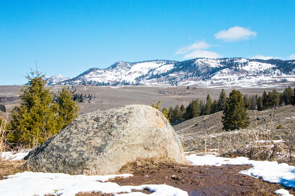 Since we did not take Hermes to the park with us, you'll have to picture him standing on this rock. ;O) The rock, we'll call him Hermes, is my subject and you can see that there is a gorgeous view of the mountains. Including the surrounding elements in your pictures is yet another way to tell a story. This one mostly tells how huge this place is, but it also shows the contrasting elements of Yellowstone - green trees, snowy mountains, winter and spring all in one place. 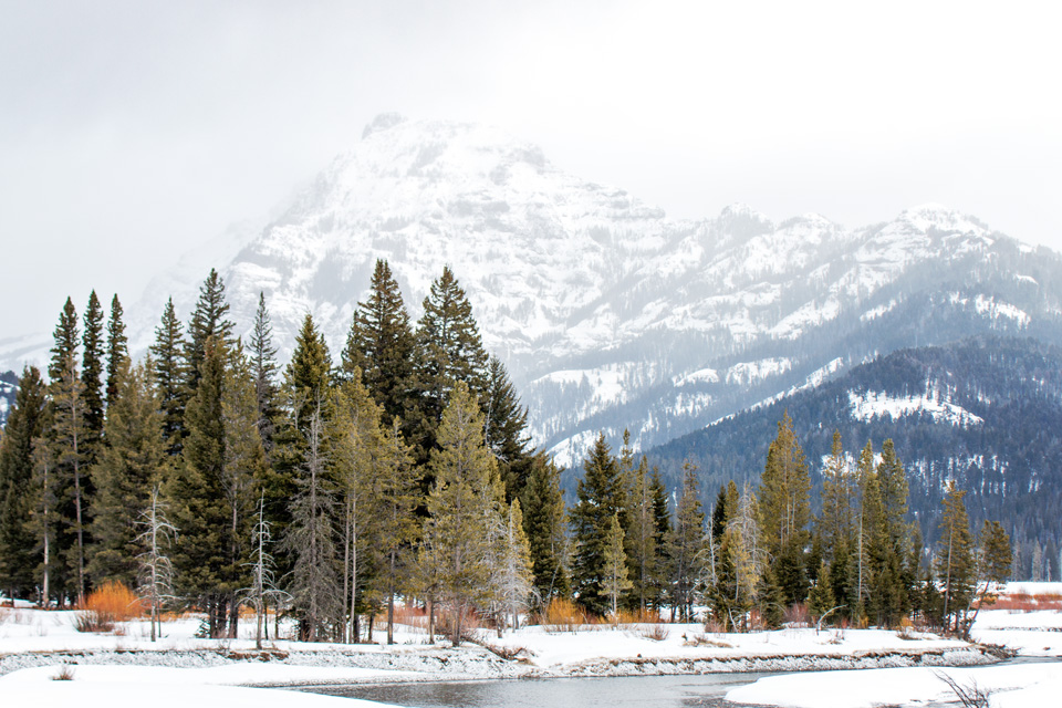 In this second picture, the trees were my subject. When I zoomed in on the trees and saw the mountains and their shadowing, I started thinking how these trees were a sampling of the thousands of trees on those mountains. I was able to hopefully get that across in my image by composing in such a way that your eye is led from the trees in front, to the dark tree covered mountain, to the lighter mountain just behind that one, and back around until it lands on the tallest mountain peak. If I had used a wide aperture the mountains would not be in focus and the image would be a picture of trees. The mountains make them much more interesting. 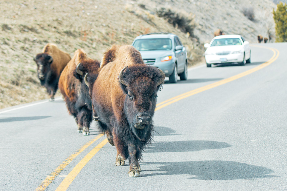 Here again, the subject is up front, but there are enough elements in the background to let the viewer see that it's not just a picture of a buffalo . . . they tell the rest of the story so to speak. (This is why we didn't take Hermes into the park. eek! ) When you use a narrow enough aperture, you start to get some fun bonuses. Bursts from bright light for example. Sometimes these bursts can get in the way of what you had in mind for your photo, but other times you can use it to your advantage. They can add a little extra warmth, fun or emotion to your image. 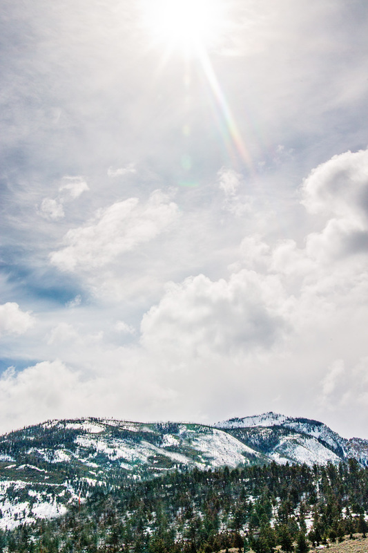 This leads right to the topic of this week's Project 52 . . . abstract photography. With abstract photography, focus is usually the first thing to go. We don't worry so much about focus or, for that matter, even what the subject is. It's all about shape, color, and form. This next group of images are of Hermes. Well, they're part of his leg anyway. He was sleeping while I snapped away trying to get creative. At first I was looking at things like his eyes, his nose and his ears. I wasn't impressed with what I was "creating." Then I tried to think like a painter (which I'm not ) and I found myself looking for curves. When I panned over Hermes I found a spot where his leg folded up onto his side while he laid curled up sleeping. The resulting images reminded me of waves that I've seen in pictures of surfers in California or Hawaii. Kind of cool actually. 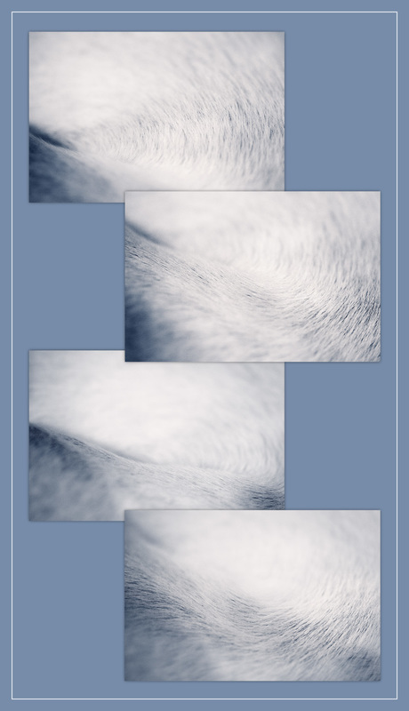 If you'd like to see abstracts that other pet photographers came up with, start with Kim - Charlotte NC dog walker turned pet photographer, See Spot Run Photography. And, as always, I wish you a wonderful weekend!
It's all about the story (echo, echo, echo . . . ) That cute furry face is great, but to see personality, I need to see what's actually going on. With this project we've seen several ways in which a photographer can use the camera settings and lenses to show the viewer exactly what she wants them to see. This week it's all about a wider aperture and we are using it to create what is called, depth of field. Depth of field is the amount of the image in front of and in back of the subject that is in focus (large depth of field) or not in focus (shallow depth of field). If your subject has a lot of background in the frame, this is yet another way to declutter things. A shallower depth of field provides a softer background so that the subject is in the spotlight, so to speak. 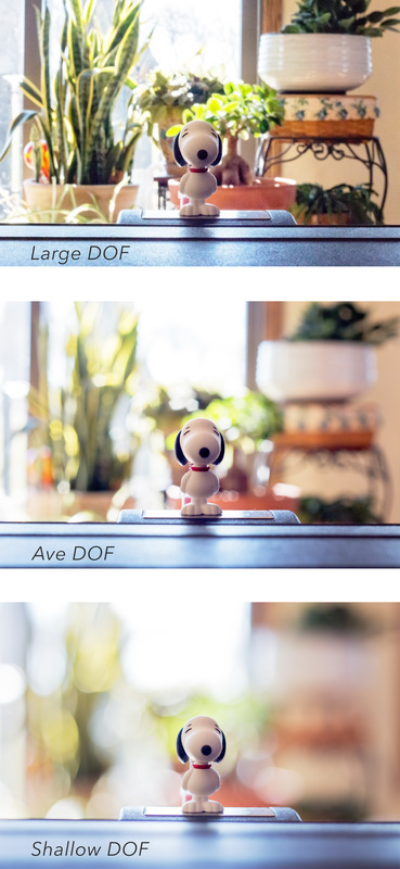 Depth of field is one my favorite things to play with. Besides being able to clean up an image, I can also be more creative with my storytelling. Here are some examples. This is a picture of my sister-in-law's dog, Katie Belle. I wanted to show how she patiently waited while everyone served themselves at Thanksgiving. (Oh, how I wish she could mentor Hermes on doggie etiquette.) You can see what's going on in the image just fine, but using a shallow depth of field, I'm able to keep Katie in sharp focus while softening the background and telling the story from her point of view. 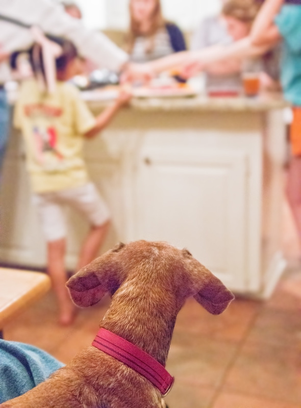 I LOVE to adjust for a shallow depth of field when I photograph pets with their owners. There is just something about being drawn in by a wonderful furry mug with the owner there, but not there. It's as if the dog is saying, "Here I am! And, by the way, this is my friend!" 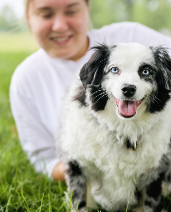 A shallow depth of field is also a wonderful tool when the owner isn't crazy about being in the pictures. (This image of Rocky was a gift for Becky's sister, Rocky's owner, so Becky didn't want to be too obvious in the photo.) 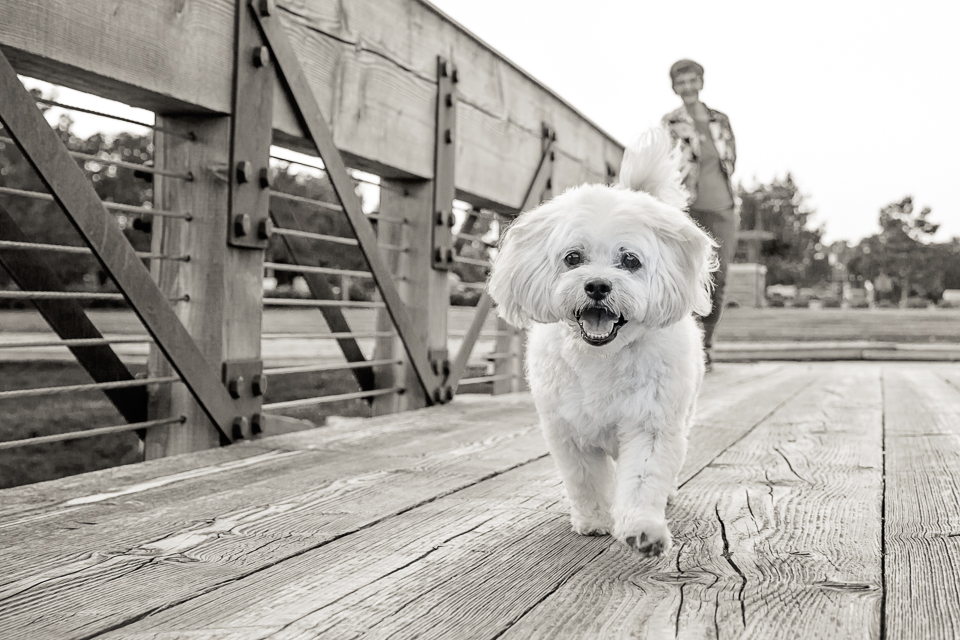 One more example - I like to get creative when I'm trying to show something about Hermes' personality. For example - his obsession with treats (ok, food . . . any food . . . ANY . . . you get the idea.) Spotlighting the treats lets the viewer know THIS is what he's focused on. (Intense... unwavering... steadfast... focus.) 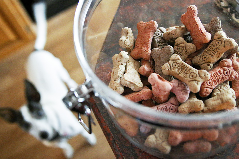 If you want to try this out with a point and shoot camera there are some settings that will control depth of field for you. In the portrait setting mode (a symbol of a person's head) you will get a shallow depth of field. If you go to landscape mode (a mountain symbol), you will have a deeper depth of field. There are several pet photographers in the Project 52 circle, so if you'd like to see how they worked with this week's lesson you can start with Rachel at Hoof N Paw Fine Art & Photography, Spokane, WA. At the end of each blog post you'll find a link to the next photographer's post so that you can make your way around the circle ending up right back here.
Have a great weekend! Happy Friday! Do you like pet pictures? You're gonna get your clicks worth today. lol A couple of weeks ago I showed you examples of how a wide angle lens allows more elements into the frame, letting the image tell a more complete story. This week I'm going to show you what can be done with a long lens (or zoom lens.) This lens moves in, isolating your subject so that the surrounding elements don't distract from that subject or story. I love my long lens for many reasons so with this week's theme I thought I'd demonstrate a few for you. First off, a long lens is perfect for pets who are a little leery about me pointing my camera at them. I have to back way up to use it and this is great when they are concerned about their personal space at the beginning of a session. I am able to zoom in from a longer distance and still get great shots of the pet without them feeling nervous. This first image is an example of just that. With this lens I am able to zoom in on Hermes so that he isn't lost in the image. (The first image is as wide as my zoom lens can shoot - 70mm, and the second is zoomed in to 200mm with me standing in the same spot.)   With a long lens I can completely eliminate all of the surrounding elements in the frame leaving only a backdrop for my subject. If I want a certain color or texture to enhance my image, I can use just about anything with a long lens. Can you guess what my background is in this image? (Hint, it can be very useful at the end of a long walk. )  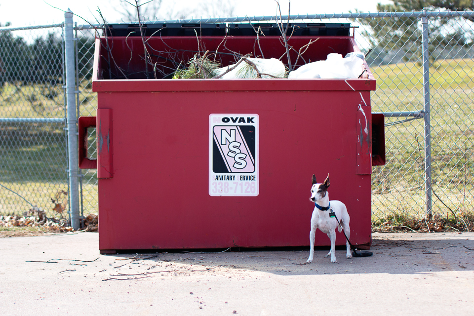 Zooming in and eliminating surrounding elements are wonderful options (if not necessary) to have when you are trying to isolate your subject in close indoor settings. We have had a house guest for a few days and she proved to be a very gracious model. This is Sky and this image was taken at 70mm with my long lens to give you a feel for where I'm shooting. 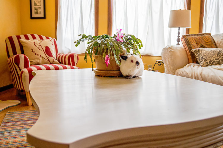 I started out using my wide angle lens. It shows the table and her surroundings, but you can also see some warping because I'm so close to her. (I personally think she looks adorable in warp mode.) ;O)  When I switched back to my long lens you can see the warping is no longer an issue. (I'm zoomed in a little, but I am a lot further away from Sky, too . . . a LOT further.)  When I zoom in even further, I'm able to eliminate the background elements and isolate her so that she is the center of attention.  You can get some great close-ups with a long lens, too. I love Sky's little mouth in this image and I love how I was able to zoom in and show her long whiskers in the next one.   My favorite thing about using a long lens is that I can take pictures in crowded places. I love the pet events that we have during the summer months. I take my long lens to these and I'm able to take pictures of people and pets without them knowing and feeling awkward or feeling like they need to pose for me. These are always some of my most favorite images. I love that I'm able to zoom in on something that is far away THROUGH a group of people or elements. At Woofstock 2015 there were people and animals everywhere. Barring one dog running directly in front of my lens, I was able to capture this sweet training moment even though they were "buried" deep within a sea of people. (I'm telling you there were people and dogs everywhere, but you'd never know it thanks to my long lens.) ;O) 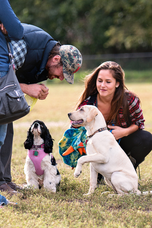 I hope you are enjoying our weekly pet photographer's Project 52. This week you can start with Northeast PA based pet photographer, I Got The Shot Photography to see how others use their long lens when photographing pets.
|
Quoted...I can't really get them to say "cheese," but I can almost always make them smile. -Kelly Categories
All
GIFT CERTIFICATES AVAILABLE
|
© 2014-2024 Little White Dog Pet Photography. All rights reserved.
Feel free to share images with your friends, but please do not crop or edit photos. (Some of the more sensitive pets feel it makes their tushie look big. )
Feel free to share images with your friends, but please do not crop or edit photos. (Some of the more sensitive pets feel it makes their tushie look big. )